
No matter how much or how little experience you have in a given niche, investing can be complicated. You’ll often be dealing with hundreds of variables, thousands of possible decisions, and a cluster of holdings in your portfolio at any given time.
Access to all this information, while simultaneously trying to make new decisions constantly, can lead to decision fatigue, and make it difficult to find the “right” decision in any one pool of options. Fortunately, data visualization may be able to help.
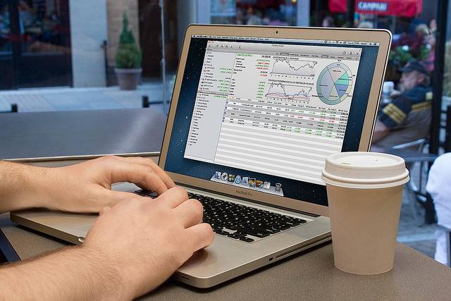
What Is Data Visualization?
Data visualization is the process of using a tool, usually a piece of automated software, to help you generate charts, graphs, and other visuals that help you make sense of complex pools of data. Businesses often use data visualization dashboards to understand how their sales and marketing strategies are performing, or track their invoicing and purchase orders, but there are plenty of data visualization tools available to investors as well.

Claim up to $26,000 per W2 Employee
- Billions of dollars in funding available
- Funds are available to U.S. Businesses NOW
- This is not a loan. These tax credits do not need to be repaid
How Data Visualization Can Improve Decision Making
So how can data visualization give you the power to make better investing decisions?
- Illustrating patterns. Visuals are exceptional at presenting patterns. The human mind is wired to recognize patterns, but it’s hard to make sense of those patterns when they appear as individual data points, such as in stock prices that fluctuate over a period of months. However, if those data points are plotted onto a linear graph, it’s much easier to spot the highs and lows, and make a guess at how that pattern could unfold in the future.
- Highlighting multiple variables. Data visuals also allow you to highlight and control for multiple variables. Depending on your goals, this could help you factor multiple variables into your decision all at once, or help you drill down so you exclusively focus on one variable’s effects on your investments. Either way, you can use visuals to make more informed decisions.
- Reducing complex subjects. One of the biggest advantages of data visualization is its ability to make complex subjects easier to understand, which is imperative in this age of big data. There are too many independent data points for any one person to track, but an automated platform can easily create a digestible version that appeals to your visual senses. Granted, not all financial topics are reducible to a simple conclusion, but visualization can make things more approachable, at the very least.
- Adding customizability. Most data visualization platforms have multiple controls that help a user customize their graphs and get exactly the visual they need to make a given decision. For example, you might be able to add or subtract specific variables, extend or contract the date range, or overlay competing subjects to get a clearer picture of what’s going on.
- Easing communication. If you’re investing with a partner, you should know data visuals also make it easier to communicate complex topics. Running a point-by-point analysis about each independent variable in your data set isn’t going to go over well with a non-technical audience; but a graph can easily highlight your most important takeaways.
The Risks
There are, however, some risks and weaknesses associated with data visualization:
- Confirmation bias. Because you’ll have full control over which variables enter into your equation, and how those variables are displayed, you may be more prone to confirmation bias. In other words, you may overvalue evidence that falls in line with your already-established conclusions, so make sure to challenge all your assumptions, and try to prove yourself wrong.
- If you only rely on visuals to communicate or make decisions, you could fall into a trap of flawed thinking without realizing it; it’s almost always better to make decisions based on a variety of factors and influences.
- Neglect for outliers. Data visuals have a tendency to mask outliers by drawing your attention to broad patterns. Overall, these broad patterns will lead you to better decisions, but sometimes, those outliers can give you valuable information about the nature of your investment. For example, the sharp dip of a stock over the course of a single day might not register in a year-long analysis, but it could be a sign of volatility and investor fear that’s worth noting.
- Optimism bias. Spending too much time looking at data visuals may also make you more susceptible to optimism bias. In other words, you may believe yourself more likely to see the positive outcomes represented in your visuals than the negative ones. You can guard against this by thinking about the worst-case scenarios as realistic possibilities.
Overall, data visualization can make you a better investor—as long as you’re familiar with both the strengths and weaknesses of these visuals, and can plan for them accordingly. Start charting out your portfolio in more interactive graphs, and make faster, better-informed decisions with the insights you draw from them.

